
We here at Sirenum are very proud of the fact that we crank out product improvements with regularity, ensuring the latest and greatest is available for all our clients. It’s a tough job for our development team but here we are, with more than 80 releases of the product having gone live since 2015.
But one thing we had shied away from for much of that time was our user interface. As you may know, Salesforce has been heralding a new user interface called Lightning for many years, and we were waiting for it to be fully (or at least close to fully) baked. As a Salesforce ISV, we task our development and product teams with leveraging the best bits of Salesforce while building out our functionality to provide the best features and user experience for dynamic workforce management. So when Salesforce finally let the reins off Lightning, we were thrilled with the opportunity to modernise our look and feel.
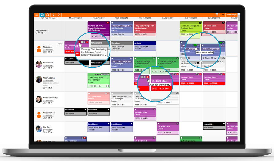
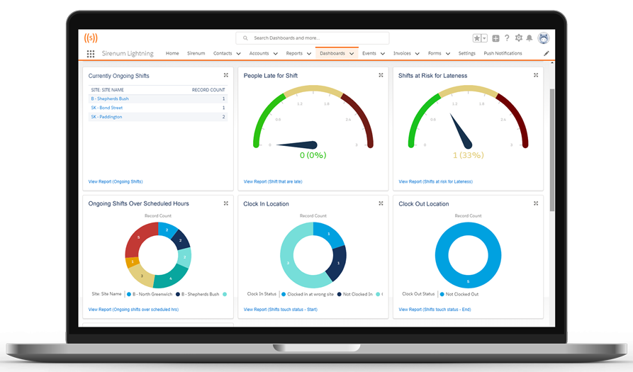
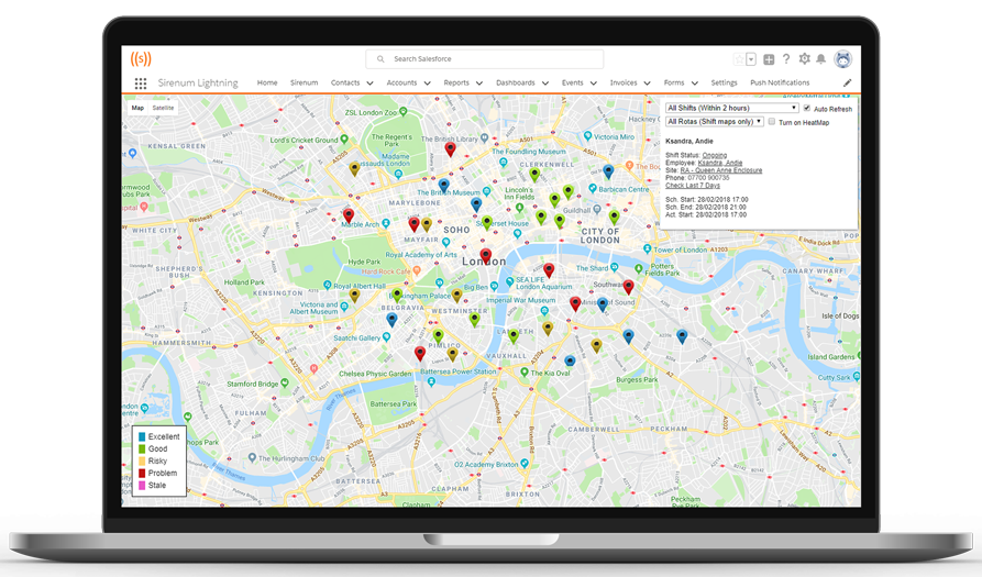
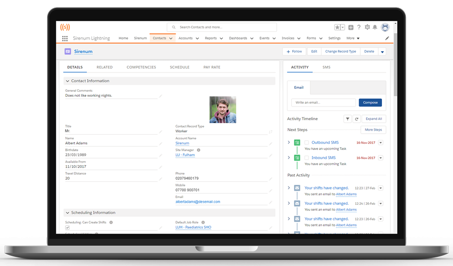
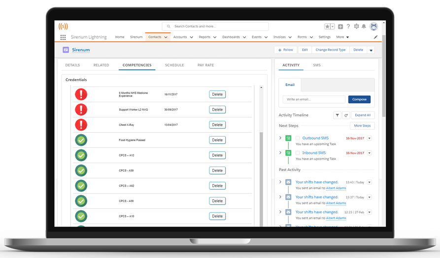
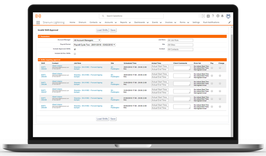
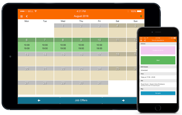
Over the past few months, we’ve been working towards finalising that new look–it won’t be completely finished until Salesforce finishes some parts of the new Lightning experience–and we’re very excited to share the results of that work. You may have actually already noticed this new look by the time you read this, as we’ve updated all our screen shots. We are confident this new UI is easier to use and easier on the eyes. Below are some highlights–each image is a screen shot of a different Sirenum module and you can click the image to read more about that module:


Leave A Comment